Client:
Transcore
Year:
2021
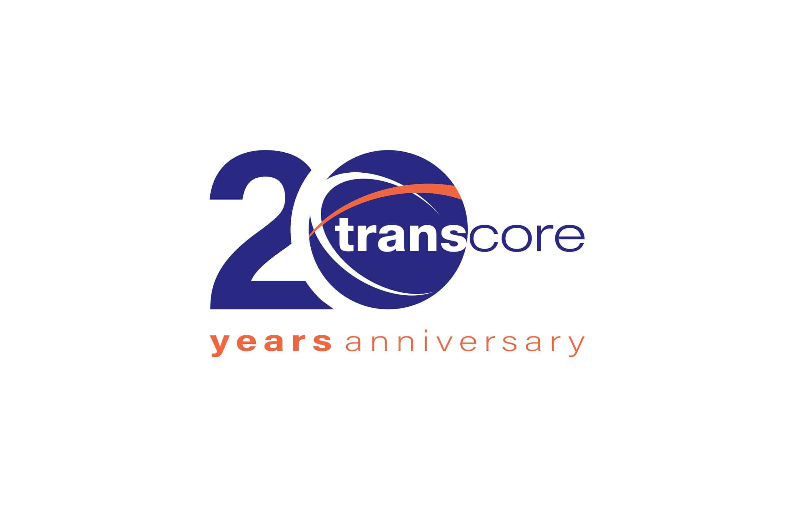
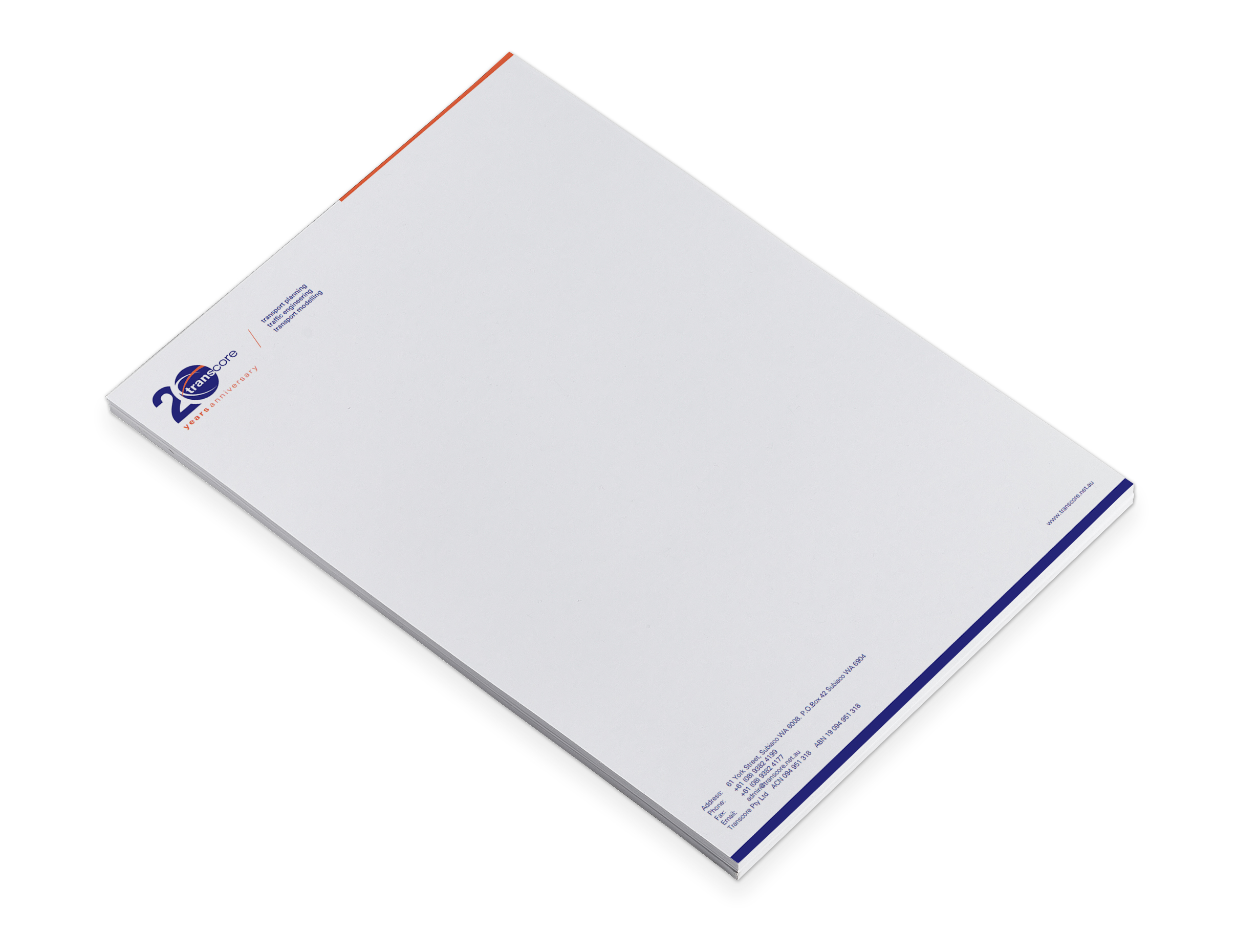
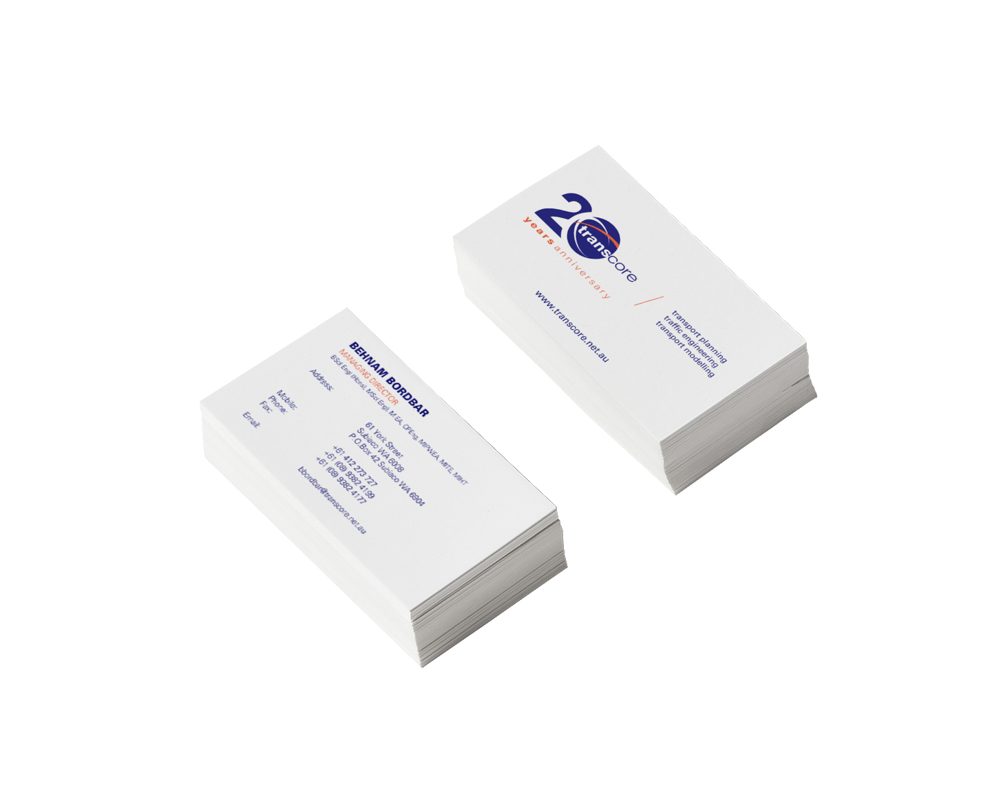
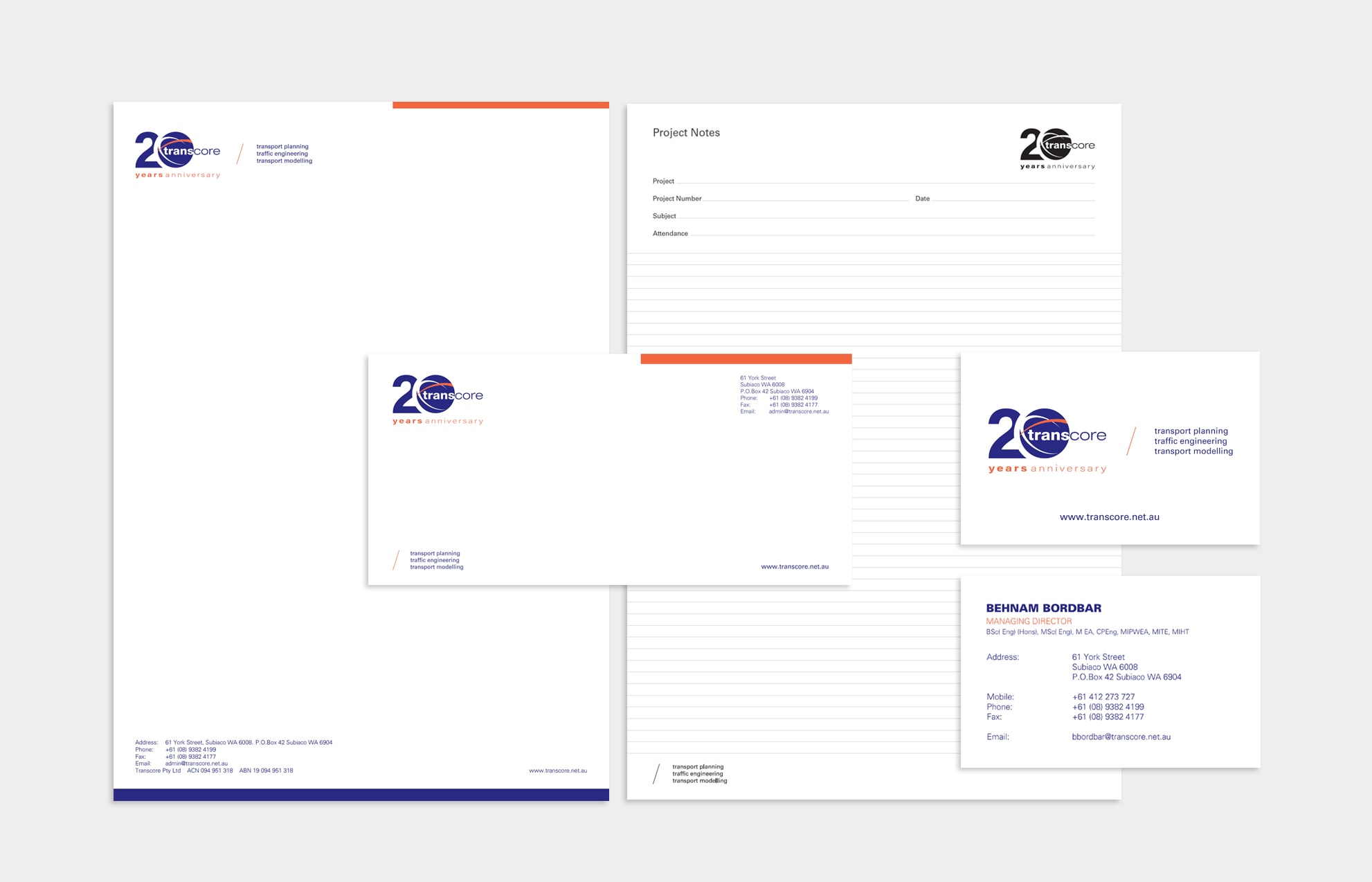
For Transcore’s 20th anniversary, the client wanted a modernized logo, stationary, and website. Their original rounded logo was a great representation of the zero, so we added a number 2 to create a “twenty,” while preserving their identity. The final stationery design features minimalist touches of color and a clean layout, showcasing the new brand.


